


Starfall Arena
A landing page for a new MOBA experience
Drinking water provider.
To present a service new for the market, and to tell people about the quality of water and benefits of the service.
oollee
Services
2018
Front-end development
Design
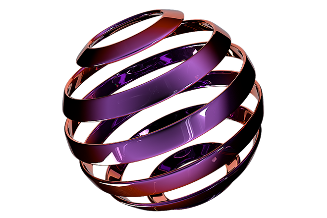
3D aquaman that reminds of how much water is important for a human. Elaboration of the matching details and a step-by-step explanation of the new type of service.
Apart from the website, we’ve designed the logo as well. «Oollee» sounds like улей [ulej], «hive» in Russian. So, the symbol of the company was formed from three water drops resembling a bee. You can see it become a preloader when you open the site, and see it go up the screen when the site’s fully loaded.
We didn’t merely fill the site with texts explaining the philosophy of water intake, but also made those texts visually attractive: the buttons got a ripple effect, and water is running over the letters — that completes the image and immerges into the atmosphere.
We focused on the animations: every button and every cursor movement, transitions, hovers and drags — everything works towards the brand’s image. For the site’s reliable work we’ve used PixiJS, WebGL и GSAP.
we craft award-winning digital experiences that reach both minds and hearts of people


We use cookies to collect anonymous data and make our website even better