Shishki park
A bright site with interactive elements for an amusement park
Mogney is a QR payment service based in California
To showcase the benefits of the service to two types of clients: businesses and individuals. Both of them needed an explanation of why it is more convenient and cost-efficient to use Mogney instead of familiar payment methods.
Mogney
FinTech
2019
Front-end development
Back-end development
Design
To simplify the clients’ questions and respective replies to several steps and to have them all on one page. The content for business and for individuals is to be changed through a ‘curtain’, showing that the service is simple and transparent.
Mogney is a new generation service that is to become a day-to-day shopping solution. To show this we designed an imaginary currency symbol because using Mogney is as easy as using ordinary cash.
The QR-code is the main character of the website. Through it we’ve shown the way complex technologies transform into simple solutions for day-to-day shopping.
Good UX is seen in tiny details. On a desktop version the QR-code slightly turns with the movement of cursor, on mobile it is connected with the device’s position: the website gets data from the gyroscope and when user tilts the device, QR-code mimics the device’s movements.
No website is worth much if it loads real slow. We pay a lot of attention to optimization and here we’ve achieved a great result: the site loads in a fraction of a second on any device.
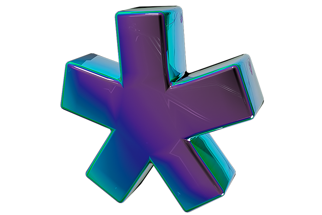
We’ve designed six 3D models for the site. They are laid over the main design and, thanks to that, they take the best place on a screen at any resolution and do not become distorted.
For the site’s sections we picked vibrant corporate colours — a blue and an orange. They are also used in the apps and in other interaction options making a clear difference between two client groups.
we craft award-winning digital experiences that reach both minds and hearts of people







We use cookies to collect anonymous data and make our website even better


